-
Faculty of Arts and HumanitiesDean's Office, Faculty of Arts and HumanitiesJakobi 2, r 116-121 51005 Tartu linn, Tartu linn, Tartumaa EST0Institute of History and ArchaeologyJakobi 2 51005 Tartu linn, Tartu linn, Tartumaa EST0Institute of Estonian and General LinguisticsJakobi 2, IV korrus 51005 Tartu linn, Tartu linn, Tartumaa EST0Institute of Philosophy and SemioticsJakobi 2, III korrus, ruumid 302-337 51005 Tartu linn, Tartu linn, Tartumaa EST0Institute of Cultural ResearchÜlikooli 16 51003 Tartu linn, Tartu linn, Tartumaa EST0Institute of Foreign Languages and CulturesLossi 3 51003 Tartu linn, Tartu linn, Tartumaa EST0School of Theology and Religious StudiesÜlikooli 18 50090 Tartu linn, Tartu linn, Tartumaa EST0Viljandi Culture AcademyPosti 1 71004 Viljandi linn, Viljandimaa EST0Professors emeriti, Faculty of Arts and Humanities0Associate Professors emeriti, Faculty of Arts and Humanities0Faculty of Social SciencesDean's Office, Faculty of Social SciencesLossi 36 51003 Tartu linn, Tartu linn, Tartumaa EST0Institute of EducationJakobi 5 51005 Tartu linn, Tartu linn, Tartumaa EST0Johan Skytte Institute of Political StudiesLossi 36, ruum 301 51003 Tartu linn, Tartu linn, Tartumaa EST0School of Economics and Business AdministrationNarva mnt 18 51009 Tartu linn, Tartu linn, Tartumaa EST0Institute of PsychologyNäituse 2 50409 Tartu linn, Tartu linn, Tartumaa EST0School of LawNäituse 20 - 324 50409 Tartu linn, Tartu linn, Tartumaa EST0Institute of Social StudiesLossi 36 51003 Tartu linn, Tartu linn, Tartumaa EST0Narva CollegeRaekoja plats 2 20307 Narva linn, Ida-Virumaa EST0Pärnu CollegeRingi 35 80012 Pärnu linn, Pärnu linn, Pärnumaa EST0Professors emeriti, Faculty of Social Sciences0Associate Professors emeriti, Faculty of Social Sciences0Faculty of MedicineDean's Office, Faculty of MedicineRavila 19 50411 Tartu linn, Tartu linn, Tartumaa ESTInstitute of Biomedicine and Translational MedicineBiomeedikum, Ravila 19 50411 Tartu linn, Tartu linn, Tartumaa ESTInstitute of PharmacyNooruse 1 50411 Tartu linn, Tartu linn, Tartumaa ESTInstitute of DentistryL. Puusepa 1a 50406 Tartu linn, Tartu linn, Tartumaa ESTInstitute of Clinical MedicineL. Puusepa 8 50406 Tartu linn, Tartu linn, Tartumaa ESTInstitute of Family Medicine and Public HealthRavila 19 50411 Tartu linn, Tartu linn, Tartumaa ESTInstitute of Sport Sciences and PhysiotherapyUjula 4 51008 Tartu linn, Tartu linn, Tartumaa ESTProfessors emeriti, Faculty of Medicine0Associate Professors emeriti, Faculty of Medicine0Faculty of Science and TechnologyDean's Office, Faculty of Science and TechnologyVanemuise 46 - 208 51003 Tartu linn, Tartu linn, Tartumaa ESTInstitute of Computer ScienceNarva mnt 18 51009 Tartu linn, Tartu linn, Tartumaa ESTInstitute of GenomicsRiia 23b/2 51010 Tartu linn, Tartu linn, Tartumaa ESTEstonian Marine Institute0Institute of PhysicsInstitute of ChemistryRavila 14a 50411 Tartu linn, Tartu linn, Tartumaa EST0Institute of Mathematics and StatisticsNarva mnt 18 51009 Tartu linn, Tartu linn, Tartumaa EST0Institute of Molecular and Cell BiologyRiia 23, 23b - 134 51010 Tartu linn, Tartu linn, Tartumaa ESTTartu ObservatoryObservatooriumi 1 61602 Tõravere alevik, Nõo vald, Tartumaa EST0Institute of TechnologyNooruse 1 50411 Tartu linn, Tartu linn, Tartumaa ESTInstitute of Ecology and Earth SciencesJ. Liivi tn 2 50409 Tartu linn, Tartu linn, Tartumaa ESTProfessors emeriti, Faculty of Science and Technology0Associate Professors emeriti, Faculty of Science and Technology0Institute of BioengineeringArea of Academic SecretaryHuman Resources OfficeUppsala 6, Lossi 36 51003 Tartu linn, Tartu linn, Tartumaa EST0Area of Head of FinanceFinance Office0Area of Director of AdministrationInformation Technology Office0Administrative OfficeÜlikooli 17 (III korrus) 51005 Tartu linn, Tartu linn, Tartumaa EST0Estates Office0Marketing and Communication OfficeÜlikooli 18, ruumid 102, 104, 209, 210 50090 Tartu linn, Tartu linn, Tartumaa EST0Area of Vice Rector for Academic AffairsOffice of Academic AffairsUniversity of Tartu Youth AcademyUppsala 10 51003 Tartu linn, Tartu linn, Tartumaa EST0Student Union OfficeÜlikooli 18b 51005 Tartu linn, Tartu linn, Tartumaa EST0Centre for Learning and TeachingArea of Vice Rector for ResearchUniversity of Tartu LibraryW. Struve 1 50091 Tartu linn, Tartu linn, Tartumaa EST0Grant OfficeArea of Vice Rector for DevelopmentCentre for Entrepreneurship and InnovationNarva mnt 18 51009 Tartu linn, Tartu linn, Tartumaa EST0University of Tartu Natural History Museum and Botanical GardenVanemuise 46 51003 Tartu linn, Tartu linn, Tartumaa EST0International Cooperation and Protocol Office0University of Tartu MuseumLossi 25 51003 Tartu linn, Tartu linn, Tartumaa EST0Area of RectorRector's Strategy OfficeInternal Audit Office
Menu layout and search of the UT website have a new look
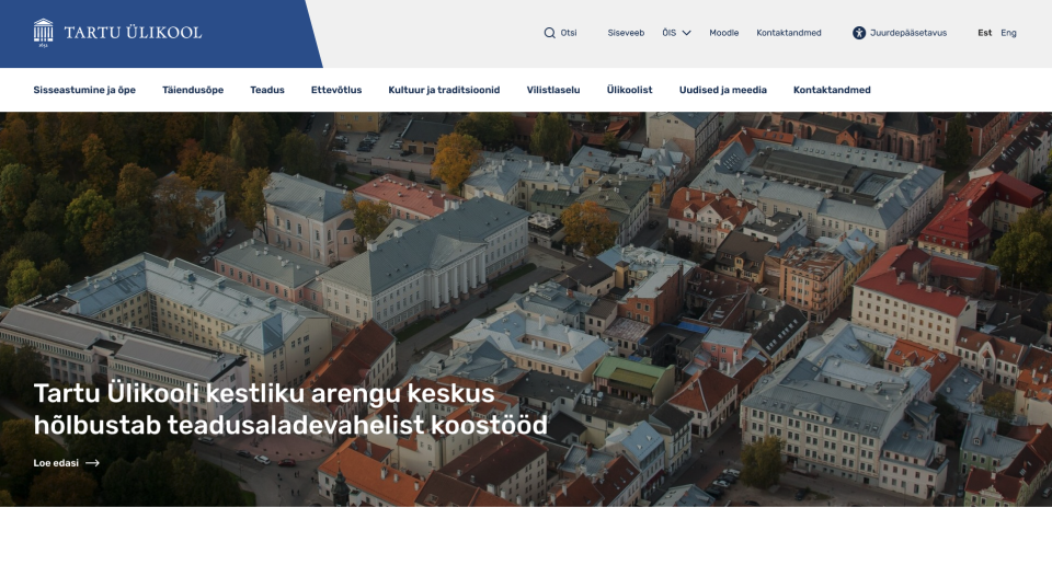
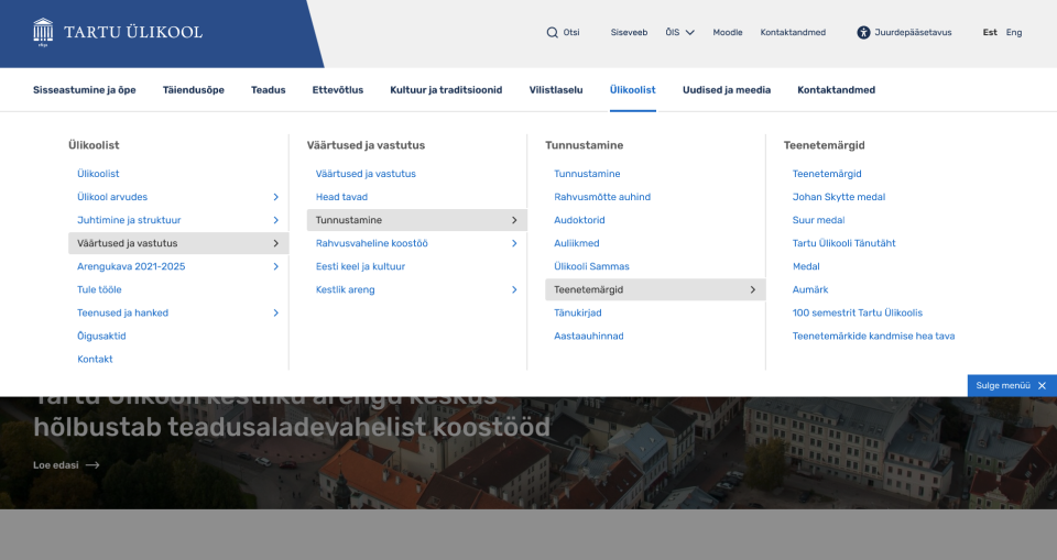
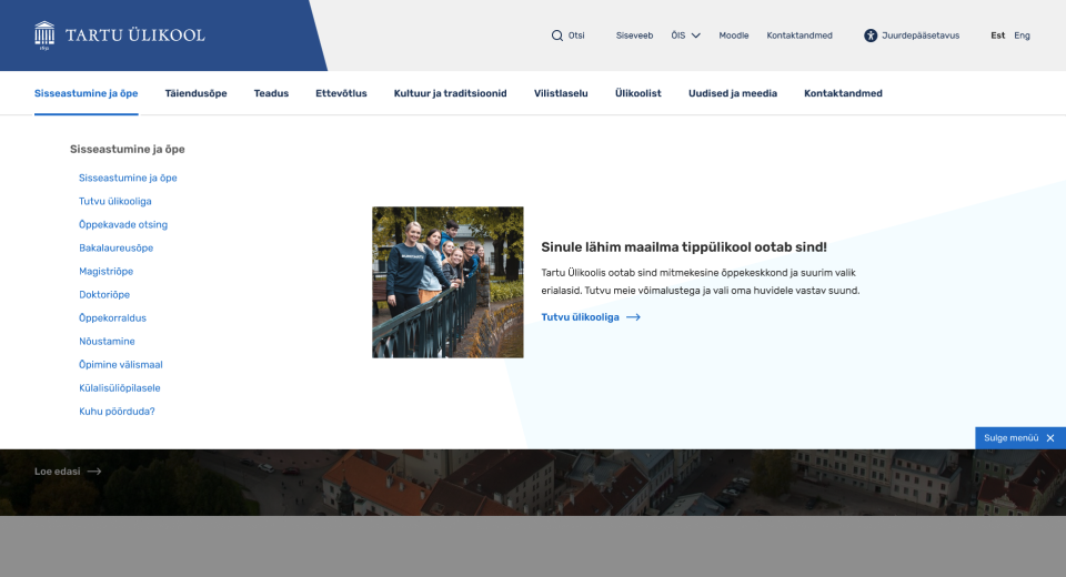
At the beginning of August, the menu layout of the UT website was updated. In the new layout, the first level of the menu is at the top of the screen and opens as a dropdown, giving a better overview of the menu items. It is now also possible to display adverts and notifications next to the menu level.
"Both internal feedback from the University of Tartu and an international report on university websites have shown that such a full-width menu is the best choice for large and complex pages, which is why we have decided to switch to a new layout," said Head of Marketing Karl Vetemaa.


At the end of June, the principles for displaying the search results on the website and the design of the search page were also changed. The system now uses the following rules for ranking the results.
The searched word or phrase
- appears in the page title;
- appears in the subheading or headings of the page;
- appears in the content of the page;
- has been tagged as a keyword on the page.
You can give feedback on the University of Tartu website on the Jira platform after logging in with your UT account.
Rector: raising an educated nation does not mean grinding down the top, it is about lifting up the lows

Information regarding the war in Ukraine

